Product Design
Music Album Redesign
At A Glance
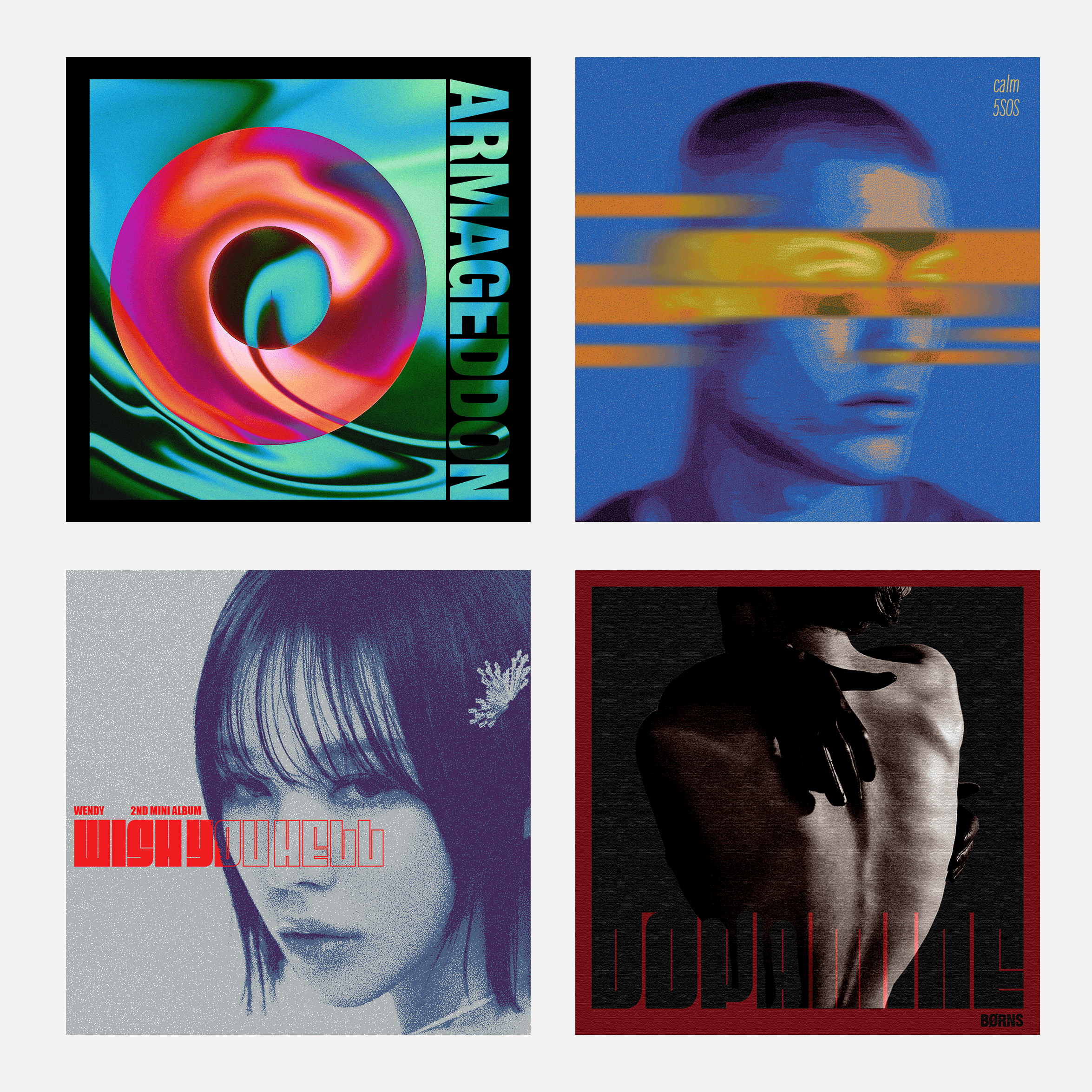
This project reimagines some of my album covers redesigns through a fresh, contemporary lens. By exploring the intersection of music and visual storytelling, each redesign seeks to capture the soul of the sound in a new, unexpected way.
| Solo Project
Visual Designer, Product Designer
01. Aespa - Armageddon
The cover design for the album captures an almost sinuous and hypnotic quality that reflects the band's concept of a multiverse, blurring the lines between the real and virtual worlds. The vibrant electric green, fiery red, and purple—representing their brand colors—infuse the design with energy and excitement. Aespa is known for their avant-garde, cyberpunk, and techno-style sound. When I think of this band, words like "metallic" and "futuristic pop" come to mind. I incorporated these elements into my album design.

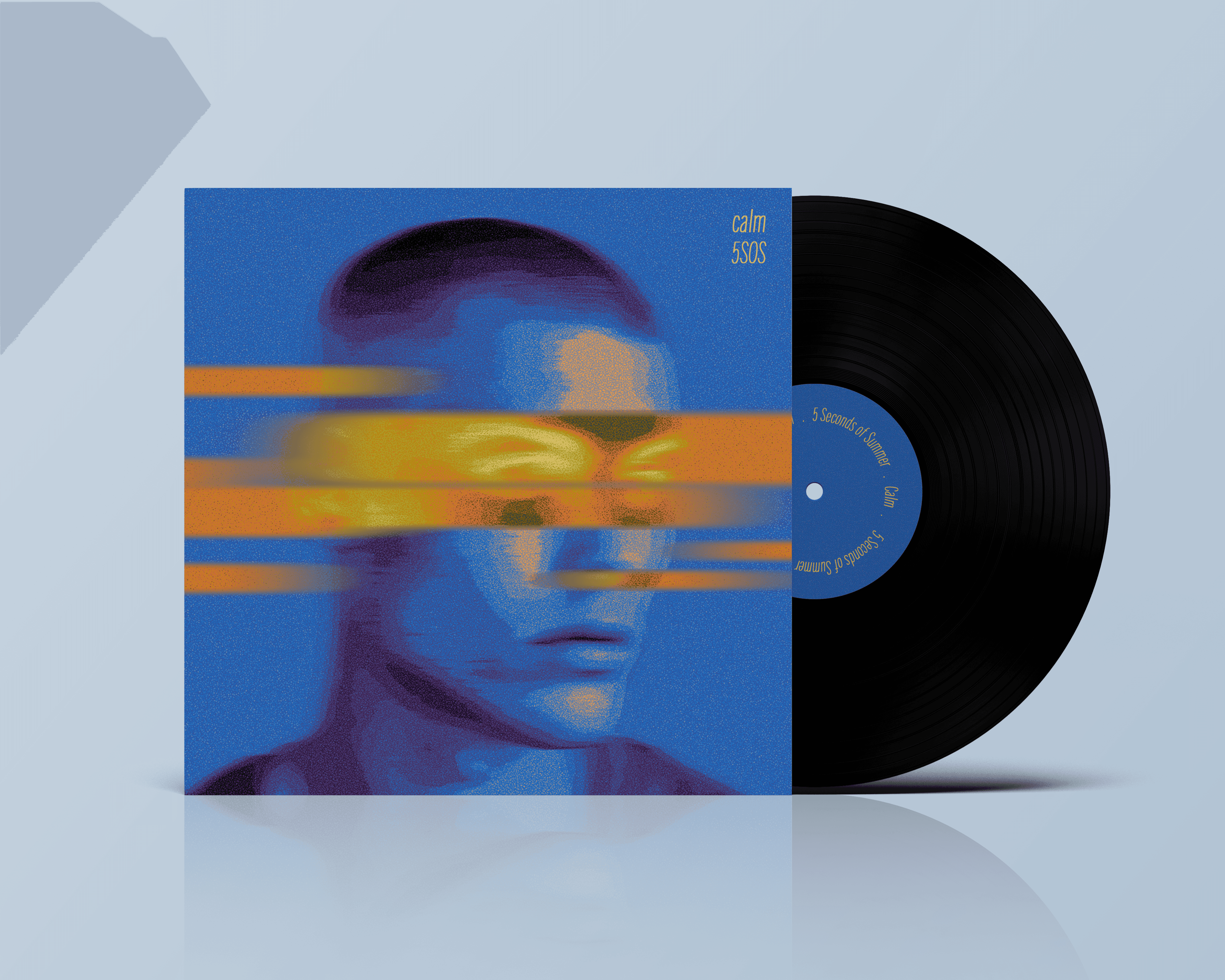
02. 5 Seconds of Summer - Calm
The album title is 'Calm,' but the songs within are anything but. The album is titled 'Calm,' but the songs inside are anything but. In line with the album name, I selected a cool color palette and used bright yellow as an accent color. The vibrant movement of the accent color mirrors the album's sound, which is loud and full of energy.
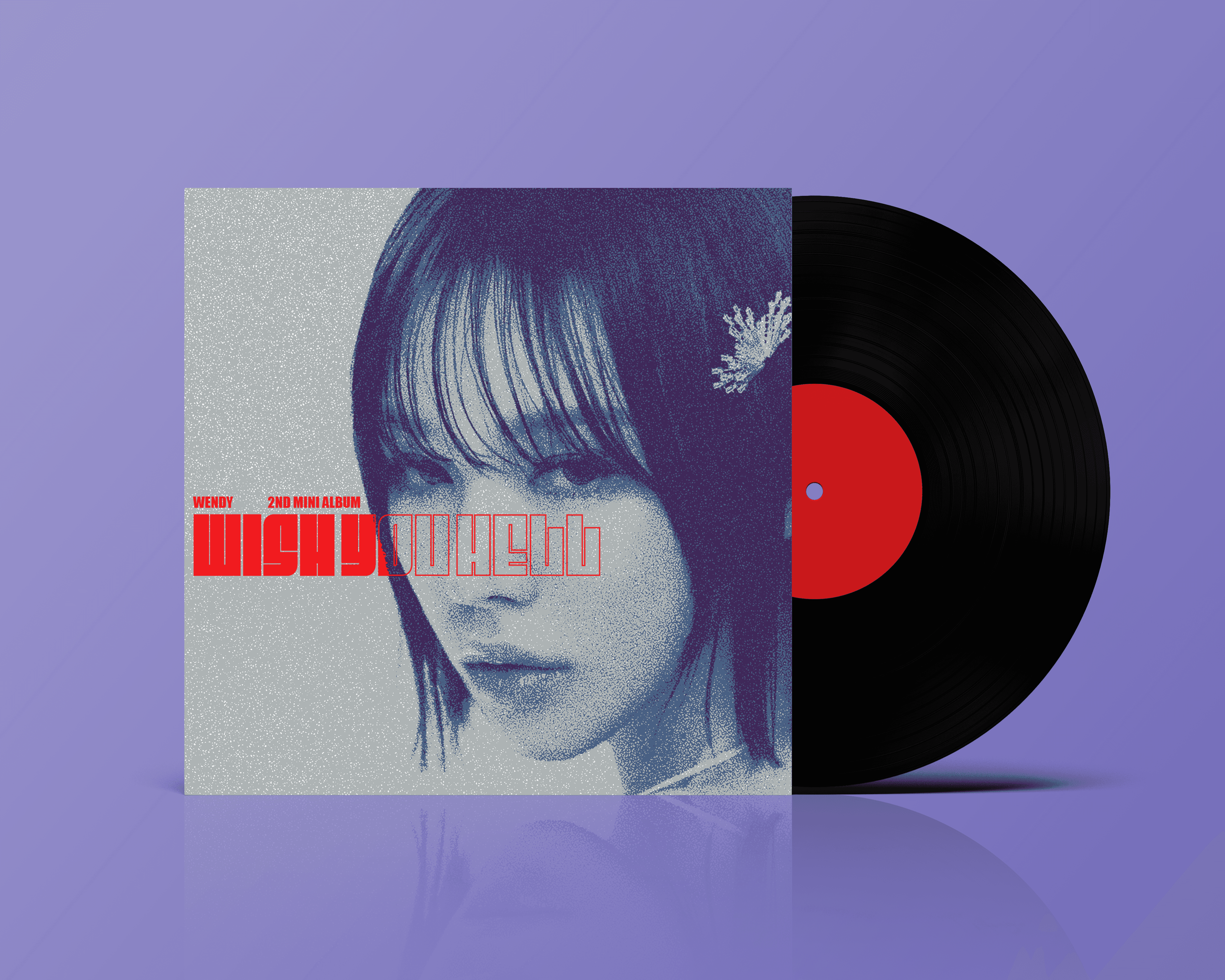
03. WENDY - Wish you Hell
For Wendy's second mini album, I opted for an intimidating album cover design. The photo of Wendy harmonizes well with the title "Wish You Hell." I selected a standoffish font to reflect the album's nature. I believe that a monochrome palette with a splash of red complements the overall aesthetic perfectly.
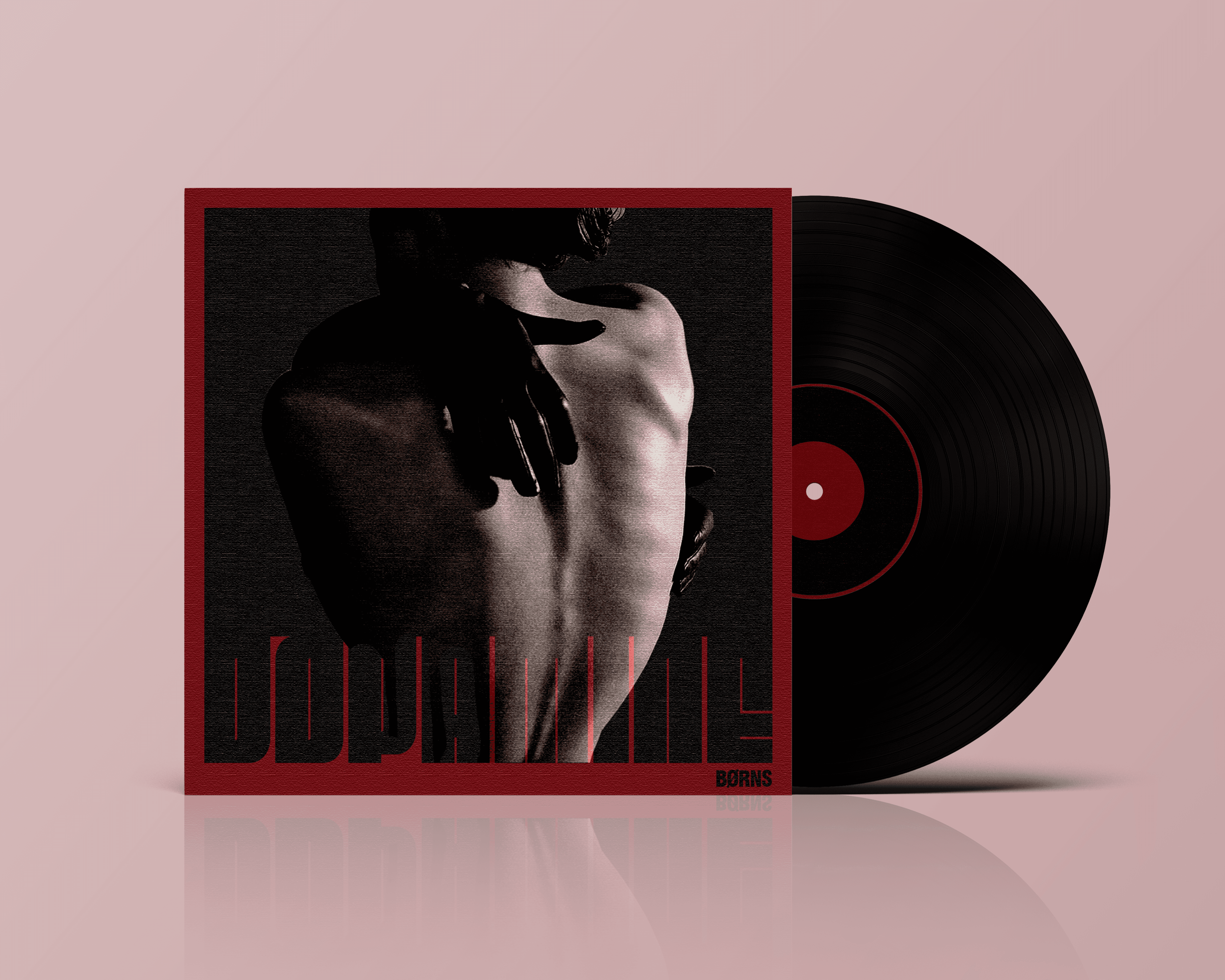
04. BØRNS - Dopamine
Dopamine's fusion of synth-pop and alternative rock influenced my design, infusing it with a mesmerizing sensuality. The deep, sultry red hue I chose echoes the exhilarating rush that the album evokes, perfectly mirroring its ethereal energy and passionate romance. The cover is meant to visually capture the album's dreamy energy and kaleidoscopic romance.
Next project
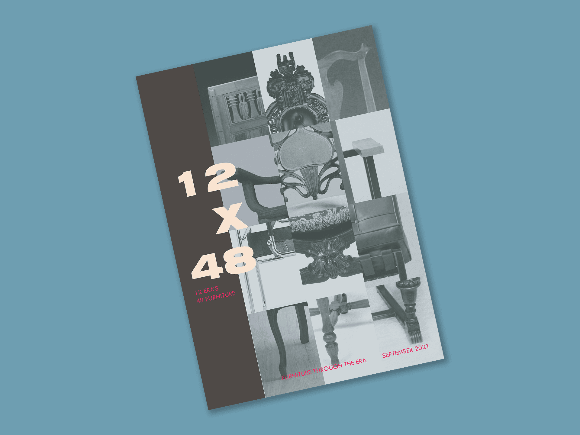
12x48